Feb 13, 2025
6 min read
Web Design Trends to Watch in 2025
Discover the latest web design trends shaping 2025, from AI-driven design to immersive experiences, and how they can elevate your brand’s online presence.
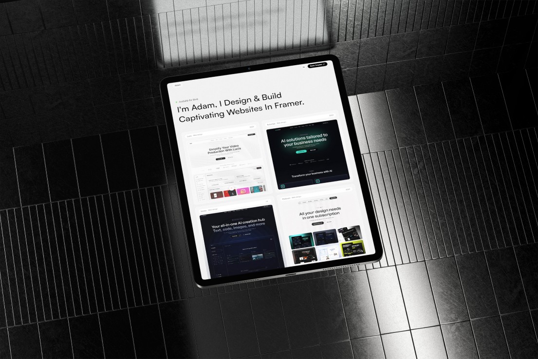
With mobile devices now dominating internet usage, mobile-first design is no longer optional—it’s essential. In 2025, more than 75% of global web traffic is expected to come from mobile devices, making it crucial for businesses to prioritize mobile-friendly experiences.
A mobile-first approach ensures websites are designed for smaller screens first, then scaled up for desktops. This strategy enhances user experience, improves SEO rankings, and increases conversion rates. In this article, we’ll explore why mobile-first design is the future and how businesses can implement it effectively.
1. Why Mobile-First Design Matters in 2025
📱 Mobile Usage Continues to Grow
Over 7.5 billion mobile users worldwide by 2025.
Mobile commerce (m-commerce) sales are expected to account for 73% of all e-commerce.
Users expect fast, seamless experiences on their smartphones.
📈 Google Prioritizes Mobile-First Indexing
Google now ranks websites based on their mobile version first, meaning a poorly optimized mobile site will hurt search rankings. A mobile-first design boosts SEO, ensuring higher visibility on search engines.
💡 Faster Load Times = Higher Conversions
53% of mobile users abandon a site if it takes longer than 3 seconds to load.
Mobile-first sites focus on speed optimization, improving user retention and conversions.
🔍 Example: Retail giant Walmart improved mobile speed and saw a 2% increase in conversions for every second of improvement.
2. Key Principles of Mobile-First Design
✅ 1. Responsive Design
Uses flexible grids and layouts to adapt to different screen sizes.
Ensures content looks great on smartphones, tablets, and desktops.
Reduces the need for multiple versions of a website.
✅ 2. Thumb-Friendly Navigation
Users interact with websites using their thumbs, so navigation should be within easy reach.
Buttons, menus, and CTAs should be large, well-spaced, and easy to tap.
✅ 3. Minimalist & Clean UI
Mobile-first design embraces simplicity, reducing clutter for a smooth user experience.
Prioritize essential content and clear CTAs to keep users engaged.
✅ 4. Fast Load Speed & Lightweight Elements
Compress images and minimize code to reduce page load time.
Use lazy loading to only load content when needed.
Optimize for Google’s Core Web Vitals to improve ranking.
🔍 Example: Pinterest cut page load time by 40% and increased conversions by 15% with mobile-first optimizations.
3. Benefits of Mobile-First Design
🚀 1. Better SEO & Higher Google Rankings
Google prioritizes mobile-friendly websites in search results. A well-optimized mobile site improves visibility, traffic, and ranking.
🛒 2. Increased Conversions & Sales
70% of mobile users have made a purchase from their phone.
A smooth mobile experience leads to higher conversion rates and lower bounce rates.
🏆 3. Improved User Experience & Retention
Mobile-first websites reduce friction and make navigation effortless.
Satisfied users are more likely to return and recommend your site.
🔐 4. Competitive Advantage
Businesses that prioritize mobile-first design will stay ahead of competitors.
A seamless mobile experience builds trust and credibility.
4. How to Implement Mobile-First Design in 2025
🔹 Use a Mobile-First Framework
Leverage frameworks like Bootstrap, Tailwind CSS, or Google’s Material Design.
Ensure layouts are fluid and adaptable.
🔹 Optimize Images & Media
Compress images without losing quality.
Use modern image formats like WebP.
Implement lazy loading for videos and animations.
🔹 Prioritize Accessibility & Readability
Use large fonts, high contrast, and clear typography.
Make buttons big enough for touch interaction.
🔹 Test on Real Devices
Use tools like Google’s Mobile-Friendly Test to check compatibility.
Test across multiple screen sizes and operating systems.
Conclusion
Mobile-first design is no longer the future—it’s the present. In 2025, businesses that prioritize mobile users will gain higher rankings, better conversions, and improved user satisfaction.
🔹 Is your website mobile-optimized? If not, it’s time to embrace mobile-first design and stay ahead in the digital world! 🚀